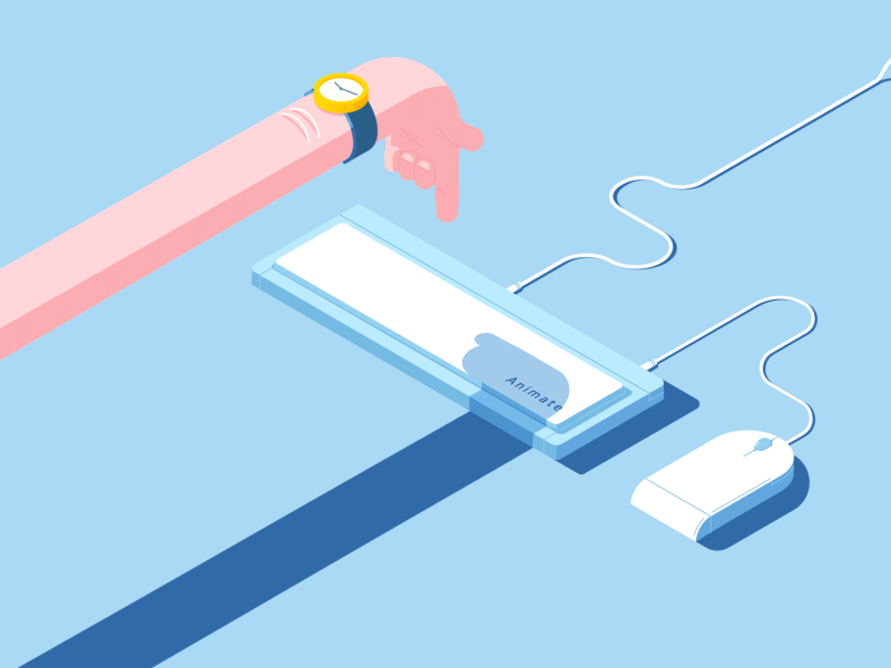
Today we’ll talk about something that seems natural and imperceptible, but turns up very important for our accurate perception of the interface visual component - about animation. We give the word to our PR-manager Maria who works a lot with video- and motion-clips answering the call of her heart and the one of duty and thereby knows first-hand how to attract the audience attention correctly, facilitate perception and not to overplay in the meantime. 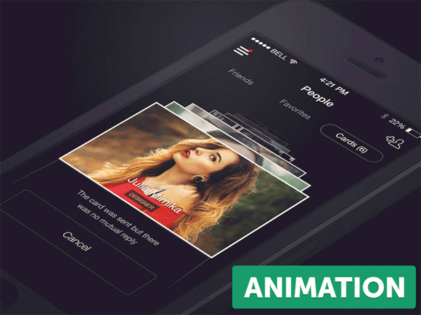
What distinguishes an excellent product? First of all, its helpfulness. By some means or other the product should solve the user’s problem with which he came to the site or application. Nothing should distract him from the problem solving, nothing should intervene or hold him back on his way to the goal. This principle is the most important while developing the usability of the site or application as well as its design.
Each element of interface is a component of a consistent mechanism, bounded by one style, ease of use, and relevance. And as a mechanism, it should move! That’s how animation comes into the play for functionality.

Microinteractions, or how to understand that everything went well
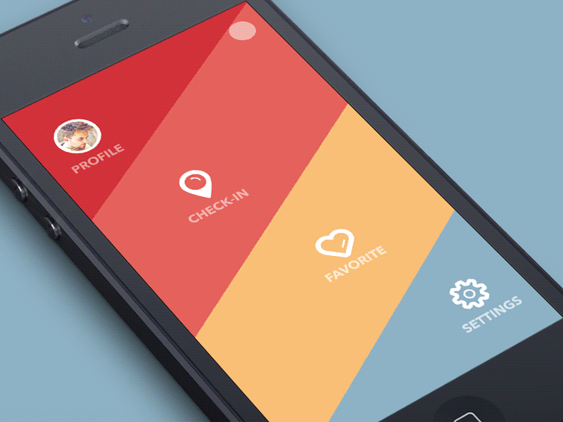
Microinteraction is one of the key elements in UI/UX-design. A notification about a message been sent, highlighting the needed element, help messages, reminders, evaluation of a photo or post you like - you don’t notice it, but animated microinteractions are everywhere. 
Our brain reacts very sensitively to the motion: we see danger in it, we have to see what is moving there and make sure it doesn’t threaten our life. In applications animated elements attract attention much more than static ones and allow to accentuate things that are planned to be in the center of the user’s attention.
Microinteractions help our brain to recognize what happened, see the progression and the result of our actions and manipulations with interface. Lack of visual response and immediate passage have a negative impact on the brain’s perception of the happening events. 
What Disney offered to UI/UX-design, or physics in art
Did you know that the term “animation”, so popular in different domains of human activities, has an ancient and we may even say philosophical origin? The latin word anima means “air, soul”, and in the most cases defines the process of making objects live through motion.
Much later than greek philosophers, reflecting about soul, in USA in 1981 appeared the book “The Illusion of Life: Disney Animation” by 2 genious animators of Disney studio, Ollie Johnston and Frank Thomas. In the book there were described 12 basic principles of animation helping to bring life to the moving picture. To the present day these principles have to be applied to everything that happens on the screen: cartoons, motion-design and interface animation.
Not all of them are used in UI/UX-design, but you definitely saw most of them on the screens of smartphones or computers. Below we will discuss the ones that are applied most often.
Principle 1. Squash and Stretch
“The remarkable feature of physical laws is that they apply everywhere, whether or not you choose to believe in them” (Neil deGrasse Tyson). Every object has a form, weight and specific properties. A rubber ball and a glass ball act completely differently at the fall, and by animation it should be taken into account to create realism of what is happening on the screen. Falling, the rubber ball squashes under the effect of gravitation, and then stretches, flying up with acceleration.
Squashing and stretching can be often seen at the animation of round buttons - this way they look more familiar, and a positive association is triggered. The “take and pull” action to update the timeline also works under this principle. 
Principle 2. Anticipation
A preventive action allows the brain to understand that the next moment something will happen and to prepare perception to the change. Remember how a car pulls off at the jump-start: it seems to move back before breaking away at the speed. An element that starts with a preparatory action, for example, moving slightly in the opposite direction, warns us about the launched action and looks more impressive.

Principle 3. Staging
One would think that by present rush for laconism and interface simplicity there can be no talk about staging. Save it for cartoons!
But it is staging of the elements that helps us to understand better what they mean and to convey the sense put into them. A pictured boiling pot, flavourous steam over a cup of coffee, turning rays of the sun - all these determines the atmosphere in the application and triggers positive emotions. The staging principle allows to explain the purpose of elements or their action to the user without additional description. 
Principle 4. Follow Through and Overlapping Action
Imagine: you walk down the street and ahead of you a beautiful girl marches, her long hair is streaming behind her, her light summer dress is waving around her legs. Suddenly she stops abruptly, remembering something. While her body stays still, her hair and dress continue their motion and only after a while stop in their turn. This is a follow through and overlapping action.
In animation of interface elements an impressive and popular trick is the damped vibration after apparition. Vibration creates the feeling of resilience, bringing the element closer to a real physical object and so making it more comprehensible.
Principle 5. Slow In and Slow Out
Slow in and slow out are the brightest representants of physical laws in animation. Look at these two moving squares: 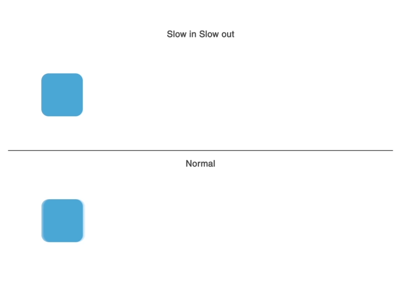
The first one is animated in completely linear fashion. The second one is animated considering acceleration in the beginning and slowing down in the end. Such animation looks more natural, because when we impart acceleration, the speed grows gradually, as well as it falls.
This principle can be met in every application and element: change of screens, menu passages, news scrolling, state-of-process animation, elements transformation - everything follows the law of smoothness, and it’s the most important principle, as by its means we catch the committed action and have time to realize its meaning.

Principle 6. Arc
Everything in the surrounding space follows an arc trajectory. The Earth moves in a circular orbit, the Sun on the sky travels in an arc from dawn until nightfall. Toss up a ball, and it will also follow a parabolic trajectory.
When a lot of interface elements are involved in a manipulation, arc trajectories help to see all of them, as they don’t overlap each other, as well as it gives time to think the next step through.

Principle 7. Timing
It’s important to give enough time to prepare the spectator for expectation of the action, the action itself and the reaction to it. The right timing at animation ensures realistic perception of images. Too quick and sudden movements are felt as unnatural, while too slow motions provoke impatience.
With all the rush for download and execution speed, the appreciation of the fact that time is needed for the spent interaction decides on the product quality and concern for the user.
Disney’s basic principles of animation include such a notion as “Solid drawing”. It is definitely important to put an emphasis not only on the application functionality, but also on its visual aspect. The originality of the idea, coloristics, typographics and wisely elaborated structure - all those are design components, and animation serves to add motion and life to the product and to bring details into focus. 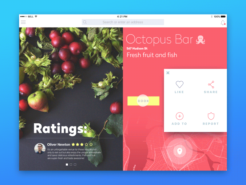
Creating solutions for the product, a designer and an animator should work at the joint of many knowledge areas: consumer psychology, programming, sometimes linguistics and other fields of science and human activity. Thorough analysis of the target audience, testing of ideas and concepts usually open the door to the higher quality of the developed interface. Cleverly used animation can become one of the ways to significantly accelerate interaction and make the use process natural and evident.