Having discussed neural networks and what our designers think about the possibilities of modern-day technologies (which you can read all about here), we decided to have a bit of fun together – and asked the AI to generate us a couple of designs for various mobile apps. Of course, the results were then presented to our three experts – let’s see what they all had to say about them.
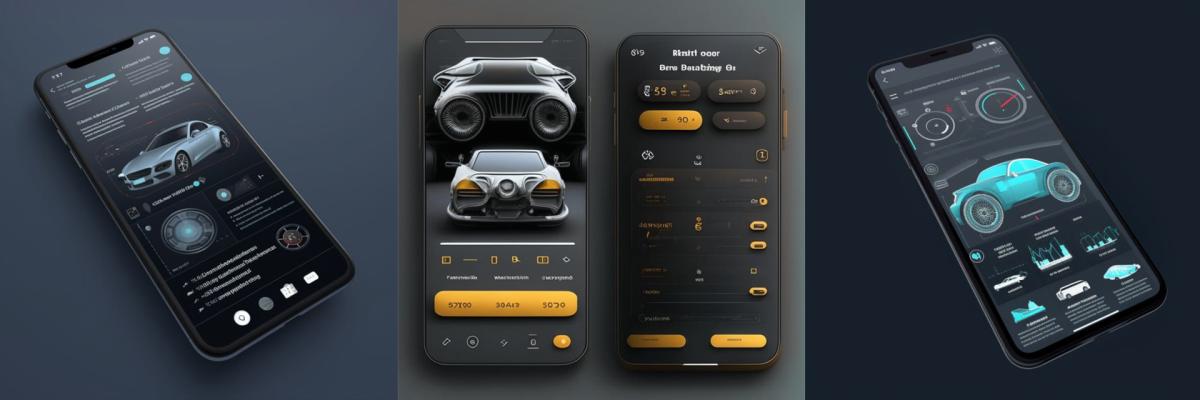
Let’s start with an app that can be used to check the condition of one’s vehicle before driving:
What do you think? Did neural networks do a good job?
Lyudmila, Senior Designer: The images look nice, but that’s about it. I guess one could draw some inspiration from them when creating their own concept art? To be fair, the task itself is a rather challenging one – considering all the functionalities required, it will take quite some time to figure out the most user-friendly and convenient UI design for such an app.
Irina, Senior Designer: Mission failed. I like the colour scheme and the general feel of it all, but the level of detailing is just bad (of course, it’s possible that neural networks will get considerably better at it in a year or two, but right now it’s an obvious flaw of theirs). There are no accents either – everything is uniform colour-wise, it’s impossible to tell if there’s something wrong with the car, what parts of it need fixing or replacing, etc. Nevertheless, I’m sure that if we pass these images on to a savvy UI designer, they’ll know how to turn them into something beautiful.
Alexandra, Middle Designer: It feels like I’m looking at stock images. There isn’t much in terms of logic or usability, plus the screens seem overloaded with data.
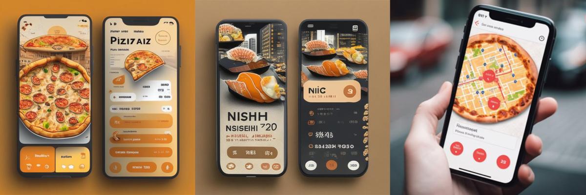
A mobile app for ordering pizza and/or sushi:
What do you think about these ones?
L.: Mouth-watering :) The illustrations are gorgeous, but they still need some tweaking and polishing to look just perfect. Replacing pizza toppings with a map was a genius move – if only it had an option to track one’s delivery driver in real time as well! Although, I should also mention that there’s not much (if at all) happening in terms of the interface.
I.: What an unusual take on the assignment! I like the illustrations, the idea to “fit” a map inside a pizza is pretty amazing too :) On the other hand, there’s no way for me to assess the UX in these.
A.: I like the pizza with a map for delivery tracking. However, the interface itself looks kind of weird – for example, it’s obvious that the buttons are all different. It would’ve been nice to have the texts generated in proper English too.
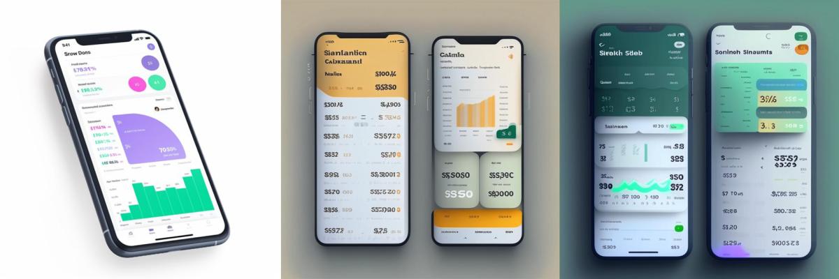
An app for tracking one’s daily/weekly/monthly expenses:
What about these?
L.: Now we’re getting somewhere. One could easily use these as references when deciding on an app’s style.
I.: Yes, the diagrams look nice, but I can’t tell what they represent at all. We need an actual business analyst here, to give meaning to all these graphic elements and back them up with real data. Would it make sense to show the statistics as a pie chart, or as a bar graph? Which figures would be the most important for a user in each case? What should the main accents be? AI can’t seem to answer any of these questions yet (I wonder if ChatGPT could be of any help here?).
A.: So far, this set of designs seems to be the most fitting in terms of the requirements given. I feel like everything looks more logical and somewhat makes more sense in general? The choice of colours isn’t too bad either.
And finally, we wanted to create a new website for Noveo – here’s what we got:

What do you say?
L.: Boring and unoriginal, like a bunch of cookie-cutter corporate websites. They have no soul, no flavour. These references can be used by virtually any company. The black and yellow one also makes me think of the JS logo… So, the red ones could be new landing pages for Ruby / Ruby on Rails? :D
I.: Way too basic :) Judging solely by the images, it’s impossible to tell what the yellow website is about; on the other hand, the one with people in red looks like it’s for a software suite for team management? The designs feel soulless – just like the rest of them, actually.
A.: The lack of originality is basically palpable in these. The designs look like every other big corporate website, there’s nothing that makes them stand out and/or grab your attention right away.
Noveo designers are unanimous in their judgement: there’s no point in worrying about the AI’s global takeover (yet) ;) In any case, the neural networks of today aren’t fully capable of competing with humans – let alone replacing them. At the same time, one shouldn’t avoid making use of the AI entirely – after all, it offers quite a number of tools that could come in handy when working on routine tasks, tackling complex projects, or looking for some inspiration. Let’s embrace this new world of possibilities and make friends with our tech! :D

Bonus chapter: Neural networks × Designers
On the spur of the moment, Mila and Irina formed a creative alliance and took on a fun challenge – to elaborate on one of the ideas presented and complete the AI’s app design. Let’s make some digital pizza!
I. + L.: We really liked the “pizza with a cityscape background” idea. It instantly made us think of a cosy neighbourhood pizzeria in some small Italian town; founded a long, long time ago, the place gets passed down from one generation to another and is now owned by a lovely elderly couple who love sharing stories of their youth but will never share their famous pizza dough recipe… Isn’t it an amazing origin story? :D In reality, it could just be an ordinary pizza chain – with some great marketing strategy ;)
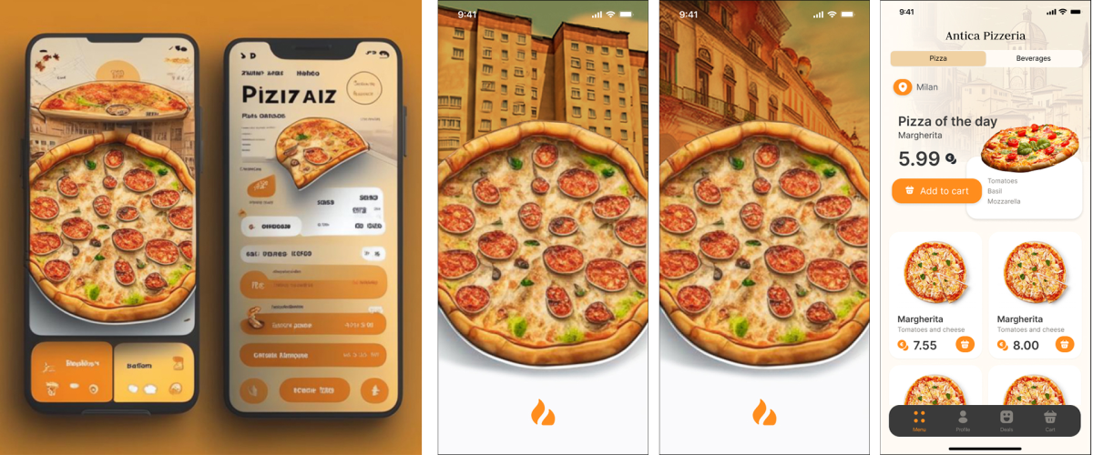
When deciding on where to take our collaborative UI design, we settled on keeping the original style of the AI-generated illustrations. As we were working “for” a pizza chain, we imagined a whole network of pizzerias in many different parts of a country – of the world? – which inspired us to create a splash screen that would change depending on a user’s location. For example, apartment buildings could represent smaller towns, whereas bustling city streets and/or skyscrapers could refer to capitals and major cities. The rest was pretty straightforward – a standard menu screen, a page with ongoing promo campaigns and combo offers, etc.
The most fun part of this challenge was our trying to finalise the illustration using the AI. Our first set of attempts was aimed at fixing the existing image by removing all of the unnecessary bits. Alas, neural networks chose to simply ignore our requests and did practically nothing. Then we changed our strategy and asked the AI to generate a separate, completely new illustration without any UI elements – we needed a massive pizza in the foreground, and a vintage-y city in the background. Each neural network came up with its own interpretation – as one can tell, it’s pretty easy to spot two different “thought patterns” in the pictures below:
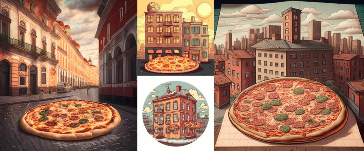
Long story short, we didn’t like any of the full-size illustrations enough to actually use them in our project. So, we switched up our prompts once again and made the AI generate us some pictures of old buildings – the results turned out to be even less fitting than any of the images we’d gotten thus far. Fun fact: for whatever reason, pretty much all of the neural networks we tried out in this experiment associated “vintage cities” with New York – however, whenever we added a word “European” in our queries, the outputs instantly changed to a mix of cathedrals, castles, and Haussmann style-inspired (read: Parisian) houses.
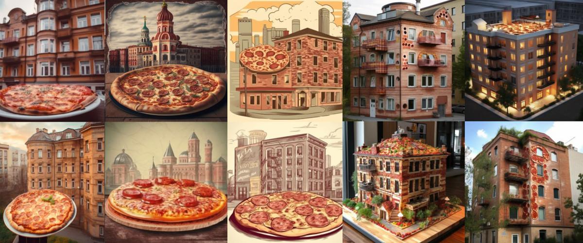
Like that, we ended up with another 20+ prompts – with different examples, clarifications, trigger words – but we still didn’t get anything even remotely similar to what we had in mind. Eventually, we decided to do everything on our own – and drafted out exactly what we wanted to see in about 20 minutes. Yes, it was definitely much easier (and quicker) to get the expected result by working on the illustration ourselves. But, at the same time, the AI fueled our inspiration, generated the initial reference image, and showed us various design options – which we could further analyse and adapt based on our needs.
Working with neural networks is quite an adventure – an exciting one for sure, but also requiring a good amount of time to be spent on its exploration. If there’s an urgent deadline you have to meet, it’s better to not risk it and just complete the task on your own. Then again, if you do have some time to spare and are looking for some fresh and exciting ideas, don’t hesitate to take a step into the AI world and have some fun with its graphic tools!