When working on interfaces, how often do you remember about the fact that different users may see colors in different ways? Color perception has many particularities, and keeping that in mind will enable you to create more convenient and enjoyable applications for a wider audience. Victoria, senior business analyst at Noveo, talks about some of the main aspects that should be taken into account when planning color schemes for UI.

About 8% of the male population has some type of color blindness (versus 0.5% of the female population with color blindness).
But designers who develop interfaces and visual communications, on the contrary, generally do not have color blindness and therefore very often lose sight of the fact that certain information cannot be adequately perceived by people with color vision impairment.
Mechanism of color vision
The color-sensitive organ of vision is the retina.
The retina consists of rods and cones.
Rods are sensitive in low light and cannot distinguish colors. It is with the rods that we see in the dark and twilight.
Cones can perceive colors in bright light. Different types of cones are responsible for their range of colors.
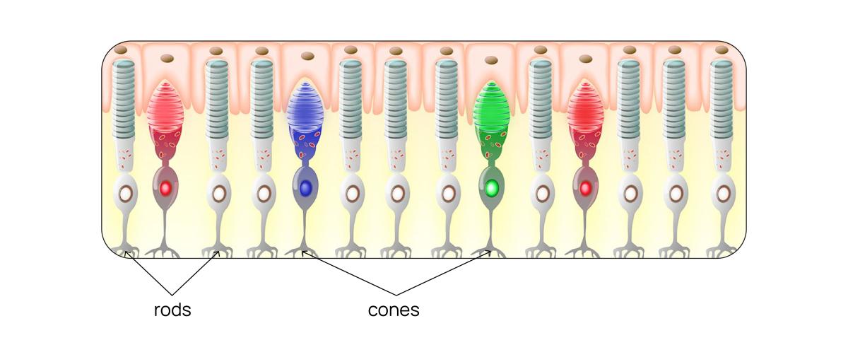
Here the graph shows the sensitivity curves of cones to light of different wavelengths. The dotted line indicates a graph of the sensitivity of the rods responsible for twilight vision - the maximum sensitivity is in the blue-green region.

Color blindness occurs when the sensitivity of the cones of a certain color is reduced or absent.
In addition, if the functioning of the rods is impaired, then they speak of “night blindness” - a person sees poorly in low light conditions.
Types of color blindness
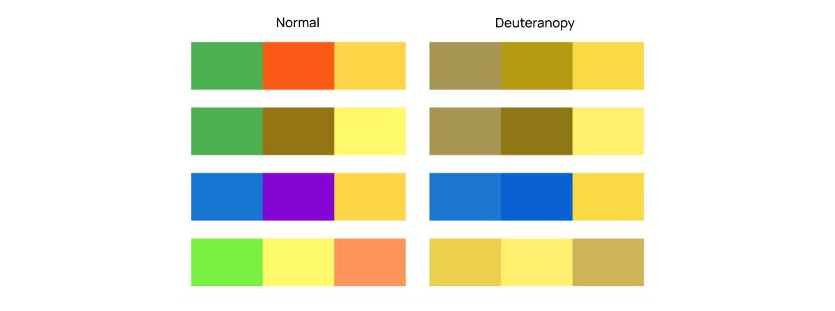
The most common type of color blindness is deuteranopia, or green color insensitivity. Slightly less common is insensitivity to red (protanopia), and blue-yellow blindness (tritanopia) is very rare.
Let's look at how people with each type of color blindness see the world using a colorful picture as an example:

Deuteranopia (insensitivity to green): here we see a lack of contrast between red and green. People do not distinguish these colors from each other, perceiving them as approximately the same brownish shades.
It is important to note that the sensitivity range of red and green cones overlaps somewhat: red cones respond to colors in the green range, but much less well than green cones, so bright green colors can appear dull and dark.

Protanopia (red insensitivity): low sensitivity to red-hued colors. Green cones are somewhat sensitive to red hues, but are much inferior to red cones in this parameter; in people with protanopia, the sensitivity of the red cones to red is reduced or absent. Because red is at the end of the visible spectrum, red hues may be perceived by people with protanopia as darker and less saturated than they actually are.

Tritanopia (blue sensitivity): This disorder is often accompanied by night blindness. Blue color is perceived not only by blue cones, but also by rods, which sensitivity peak shifts to the violet region in bright daylight. People with tritanopia have a genetic abnormality that interferes with the synthesis of pigments responsible for sensitivity to blue and, very often, also for dark vision. People with tritanopia not only have difficulty distinguishing between the colors blue and green, but also very often yellow, red may be perceived as darker, and blues and purples as dark or gray.
 Achromatopsia: complete color blindness. There exist rod (no cones) and cone (different colors are perceived as one color tone, photoreceptors are not able to determine the wavelength and intensity of the signal) blindness. In the case of rod achromatopsia, vision has increased sensitivity to light. Rods have high sensitivity and are responsible for twilight vision, so the perceived image is often “exposed.”

Interesting fact!
The pigment responsible for twilight vision, rhodopsin, is found in rods.
Rhodopsin is destroyed by exposure to bright light and restored in the dark. This is what explains the adaptation of the eyes, when we go into the darkness from bright light - at first we see nothing, but gradually the eyes adapt, and we can see the surrounding objects.
Rhodopsin in rods is also associated with the perception of blue color: in daylight, its maximum sensitivity is in the violet region. Therefore, tritanopia (blue color blindness) is very often accompanied by night blindness, since the synthesis of rhodopsin is impaired.
How do colorblind people see the world around them?
To begin with, trichromacy is an evolutionary advantage for humans, who, in order to survive, have become necessary to distinguish between red and green colors, for example, to find fruits and berries among green foliage. However, many mammals, such as cats and dogs, are dichromats.
In addition, there are representatives of the animal world - tetrachromats: some species of birds and bees are also sensitive to the ultraviolet spectrum of light waves.
Surprisingly, tetrachromacy can also occur in humans - as a very rare mutation. Cones containing another type of light-sensitive pigment appear in the retina of the eye. Due to the rarity of this anomaly, it has been studied very little.
Let's return to color blindness: such a mutation as deuteranopia (reduced sensitivity to green) is not uncommon, while our interaction with the outside world is very often built on the fact that we must be able to distinguish between red and green colors.

According to statistics, most likely among your friends and acquaintances there will definitely be 1-2 people who have some form of color blindness, and most likely it will be deuteranopia.
Let's look at a few examples of how colorblind people see interfaces that are familiar to many:
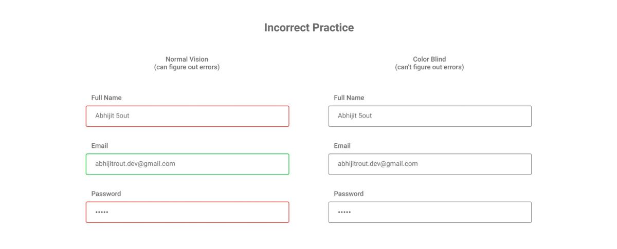
1. If the errors do not differ in anything other than the color from the correct filling of the fields, then colorblind people have a hard time.
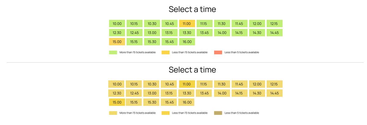
2. The contrast of green and orange is poorly distinguishable; colorblind people cannot understand which slots are still free and which are occupied:
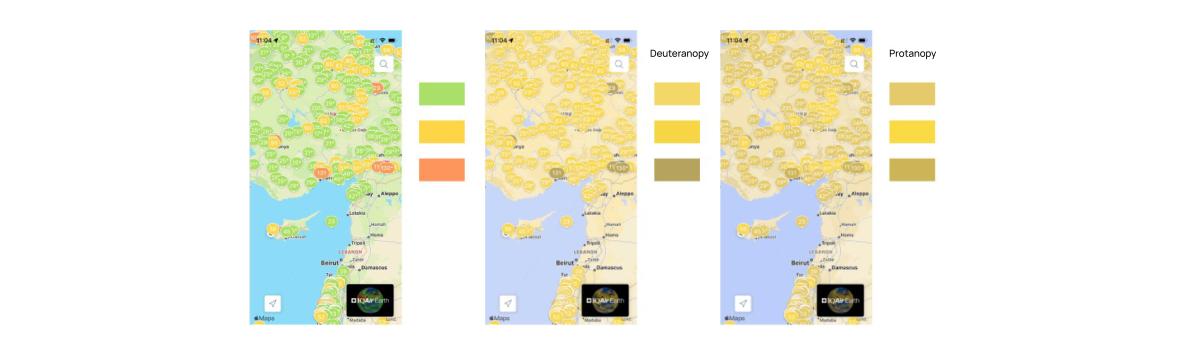
3. A common pattern - the use of green, yellow and red - is actually incomprehensible to colorblind people:
4. Color differentiation of metro lines is not always clear to colorblind people:

Accessibility Standards
The standards for developing inclusive and accessible interfaces take into account not only the vision of people with color blindness, but also other cases of disabilities:
- decreased visual acuity,
- complete lack of vision,
- reduced mobility,
- decreased hearing acuity,
- decreased attention (for example, when driving a car).
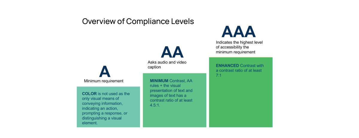
One of the sets of recommendations for designing accessible interfaces is WCAG (Web Content Accessibility Guidelines), this set contains specific recommendations for creating accessible interfaces, and also standardizes various levels of accessibility:
A - minimum compliance with standards: the interface is visually distinguishable, the actions available in the interface are clearly indicated.
AA - average compliance with standards: sufficient contrast for people with color perception problems, support for assistive technologies (voice assistants, dictation, etc.).
AAA - maximum compliance with accessibility standards: high contrast and readability, full support for color blindness and color perception features, the best accessibility of interfaces for assistive technologies and assistants.
Good Interface Design Practices
People with color perception difficulties may see the interfaces we are familiar differently from the way designers, who most likely do not suffer from color blindness, see it. That is why it is very important to take into account the features of color blindness when designing interfaces.
Let's look at a few good practices, tools and design patterns:
1. Test interfaces on color blindness simulators
There are a great variety of color blindness simulators. You can use any of these to make sure your interface is visible and contrasty for those with color vision impairments.
There are also plugins for Figma, with which you can check layouts at the stage of their development.

There are several models for simulating color blindness that can be used depending on various factors, such as whether the software interfaces being designed are light-emitting or “analog” objects. This simulator allows you to evaluate the interface in different models:
https://daltonlens.org/colorblindness-simulator

2. Check the contrast and readability of the text
Text that is too small or lacks contrast is difficult to read.
Some color combinations will be low-contrast and difficult to distinguish not only for people with color blindness, but also for ordinary people with full vision.
Checking for contrast and readability of text and interface elements will not be superfluous in any case. This can be done using the service:
https://webaim.org/resources/contrastchecker/.
This resource also provides a wealth of information about accessibility standards for people with various disabilities and good interface design practices.


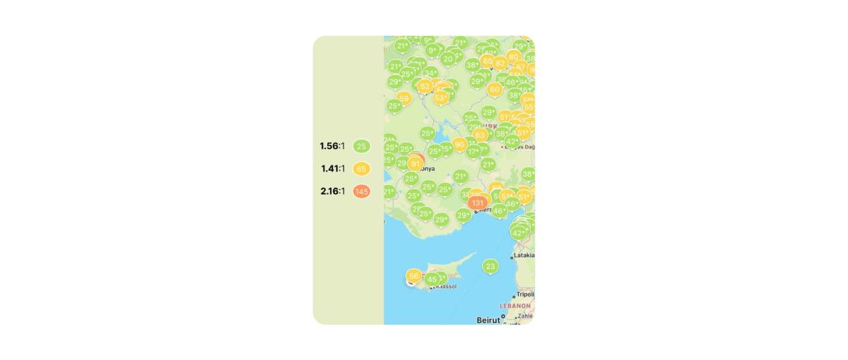
Above we have already featured screenshots of an application for monitoring air quality - having checked its interface in this service, we see that it has little contrast even for people with full vision:
3. Avoid certain color combinations
People with color vision disorders cannot distinguish certain colors. Keeping in mind the most common types of color blindness - deuteranopia and protanopia, it is worth paying more attention to combinations of green and brown, green and orange/yellow, blue and violet and try not to use them in those interface elements that users need to distinguish.
4. Use text clues to indicate colors
Colorblind people will not appreciate the opportunity to choose the color of clothing in an online store only according to the color palette: many colors look the same or are barely distinguishable.
A good practice in this case is to also use text clues to indicate colors.

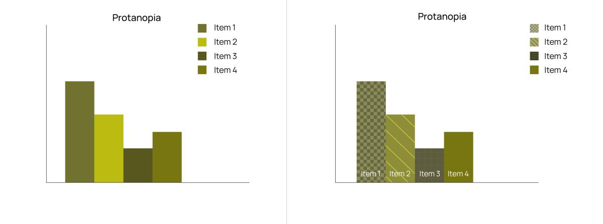
5. Use not only color indication, but also icons and textures
In situations where it is inappropriate to sign a color with words, it is worth using textures, icons or inscriptions which will allow you to distinguish interface elements, diagrams or infographics.
![]()
6. Check that the interface is distinguishable and contrasting in black and white
By desaturating the interface, we can see how contrasting elements are with each other, regardless of their color. However, such a test is only one step in checking the accessibility of interfaces in general, and it is worth looking at other aspects in addition to this. As mentioned earlier, in people with color blindness, different colors have different brightness and contrast due to the fact that the sensitivity to certain colors is reduced or distorted, hence the perceived contrast will be different from the black and white version.

Conclusion
Features of color perception are innate. People with such features do not know how ordinary people see the world, so they cannot explain what exactly they do not see very well.
Adopting accessible interface design practices improves the overall user experience by making systems more intuitive and effective for a diverse audience.
More articles to read: