In the first part, we looked at the mechanism of human color vision and good practices for designing interfaces for cases of color blindness. Color blindness is a congenital anomaly with which a person lives his entire life, but temporary color blindness also exists: at dusk a person has monochrome vision and is unable to distinguish colors.
Twilight vision mechanism
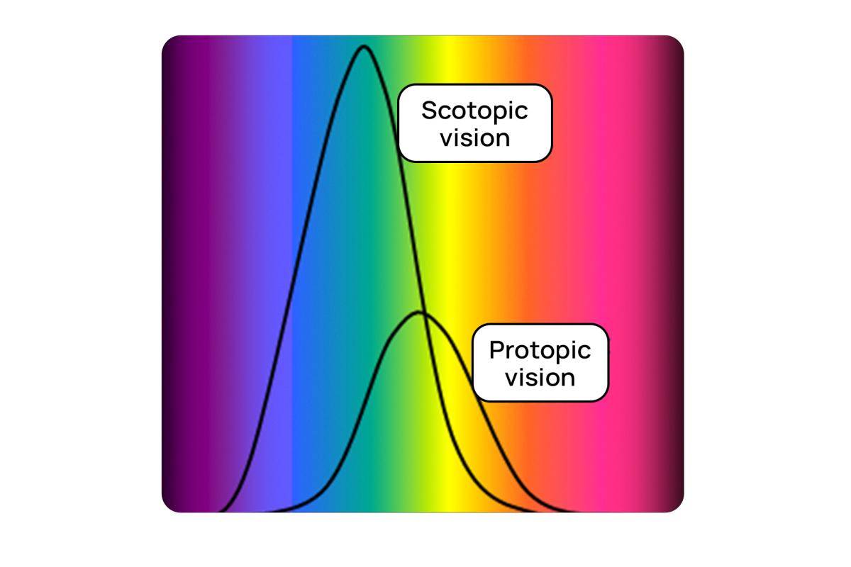
In daylight, a person perceives the world around him through cones, which are sensitive to different areas of the spectrum. This causes color (photopic) vision. Rods, in turn, are 100 times more sensitive to light, thanks to them we are able to see at dusk and have scotopic vision.
Meanwhile, the rods lose sensitivity in bright light because the rhodopsin pigment they contain is destroyed by exposure to daylight. Rhodopsin is completely restored after about 30 minutes of being in the dark or twilight - this is what causes the eyes to “get used” to the dark.
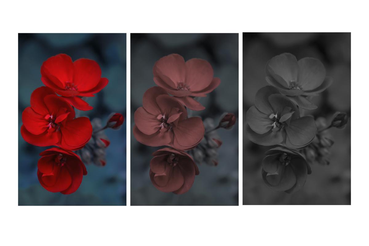
However, at dusk we see the world around us differently than during the day: we cannot distinguish colors, and the perception of some colors at dusk is distorted, for example, red seems almost black to us, because the peak sensitivity of the rods occurs in the blue-green region - this is color twilight sky.
The macula of the eye contains the maximum concentration of cones responsible for color vision. Meanwhile, the vast majority of cones in the macula are red or green. There are critically few blue cones in the macula; they are mainly located on the periphery. In other words, we perceive blue colour the worst. In addition, due to the longest wavelength, blue color is the most subject to dispersion (scattering).
Practices for designing interfaces for twilight and low light
When we talk about twilight interface design practices, we're talking primarily about software interface design: this applies to devices with displays that themselves emit light.
The range of light sensitivity of rods and cones overlaps slightly: this way you can catch the moment when the rods are already active and we are able to distinguish objects in low light, but the cones are still active as well and we are still able to distinguish colors.
Practice No. 1. Minimize device screen luminance
When designing software interfaces for low-light conditions, it is important not to “light up” the retina of the eye, so as not to turn off rod vision and disrupt the perception of the surrounding space outside the screen. For these purposes, “dark themes” of software interfaces are designed:
- Dark background (for example, black or dark gray) with minimal screen luminosity. It emits less light than white or any other saturated color.
- Contrasting interface elements with reduced saturation but higher brightness. Only functional interface elements should receive maximum screen luminosity.
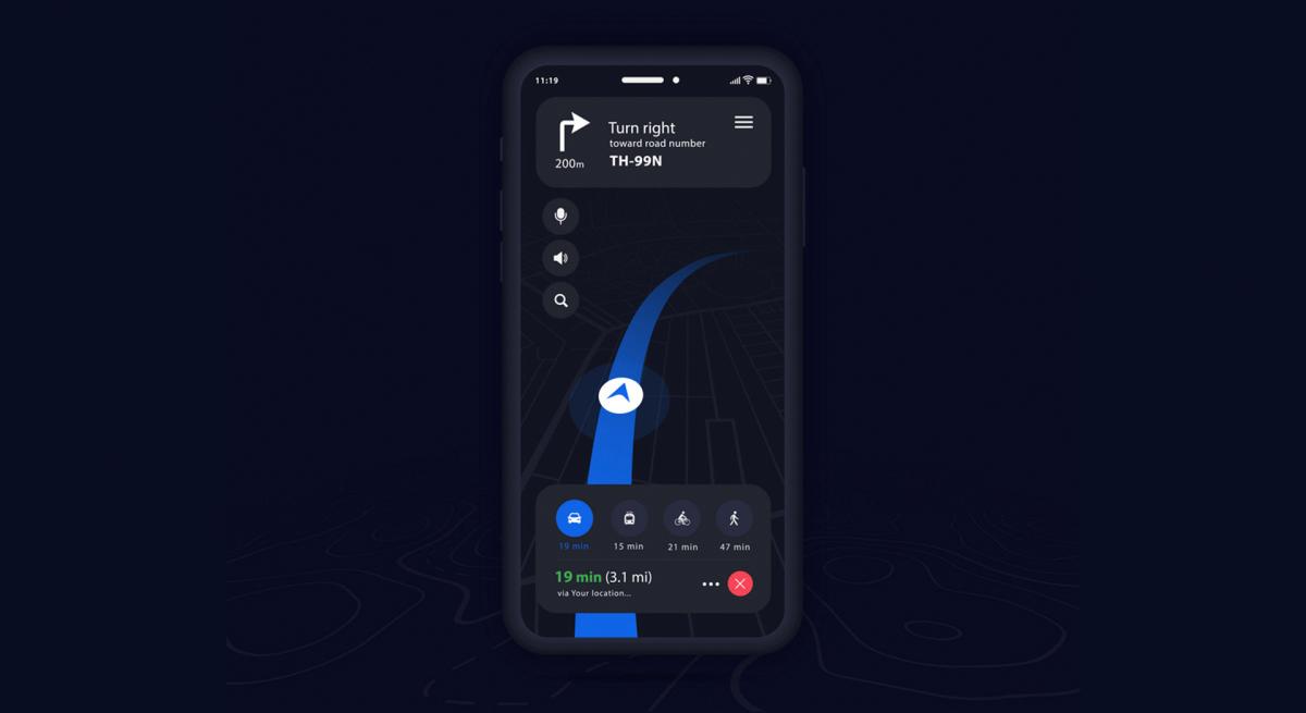
Thus, when switching between the device screen and the outside world, for example, while driving a car in the dark using a navigator, a person can still perceive the space around: the device screen does not dazzle, and the eyes need to adapt less to the perception of the road in front of them.
Practice No. 2. Explore your system's usage patterns
How and under what conditions will users use your system? How will its use be integrated into human interaction with the environment? Will the system be used in complete darkness or in low light?
For example, in the case of a car navigator, the user will most likely look at the device screen only briefly, and most of the time keep an eye on the road illuminated by headlights; the user will perceive the application screen in his peripheral vision. In such a situation, bright interface elements are needed to indicate the most important things: the direction of the road, maneuvers and any dangers - so they will be sufficiently noticeable in peripheral vision. The rest of the interface elements can be muted, because the user will not access them in a situation of limited attention, that is, not while driving, but before or after a trip.
In situations where the interface is actively used in the dark, elements can have low contrast between themselves so as not to illuminate the light field - the user will be able to distinguish them from each other.
Practice No. 3. Select colors for interface elements
There are ongoing conflicts regarding the choice of color palette in twilight interfaces.
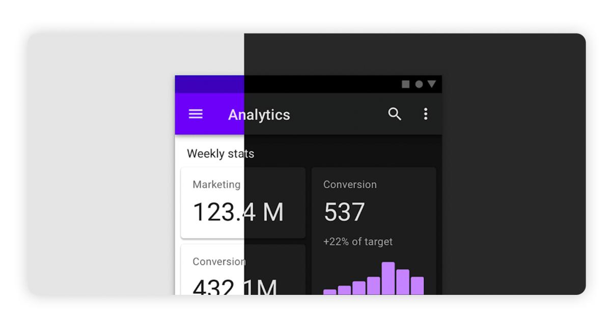
On the one hand, Material Design guidelines actively promote the use of lilac/purple for both light and dark themes. And there is an explanation for this: this violet color is perceived almost entirely by blue cones, so it is best seen by people with color blindness to red or green.
On the other hand, there is a danger in using purple and blue interfaces for dark themes, and it is as follows:
- violet color is perceived by blue cones, and there are catastrophically few of them in the retina of the eye;
- blue cones are located mainly on the periphery of the retina, there are very few of them in the macula;
- blue color is more subject to dispersion and blurred than others.
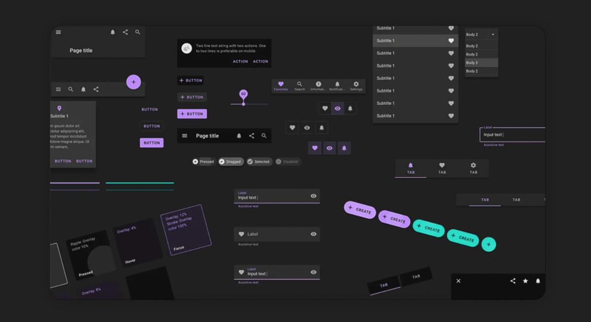
For these reasons, blue UI elements may be harder to read and appear blurrier. This is not noticeable for “light” themes when blue is the accent color: there is nothing wrong with the main blue color of the Facebook interface. However, for dark themes, the color of elements is used to a limited extent: these are buttons with a thin outline, the color of text or icons - in other words, there is practically no solid fill with an accent color in dark themes.
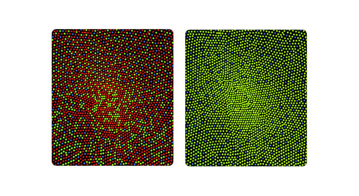
For example, compare the same interface elements, but made in purple or red. Most likely, if you are not colour blind, then red elements will be more comfortable for you to perceive than purple ones.
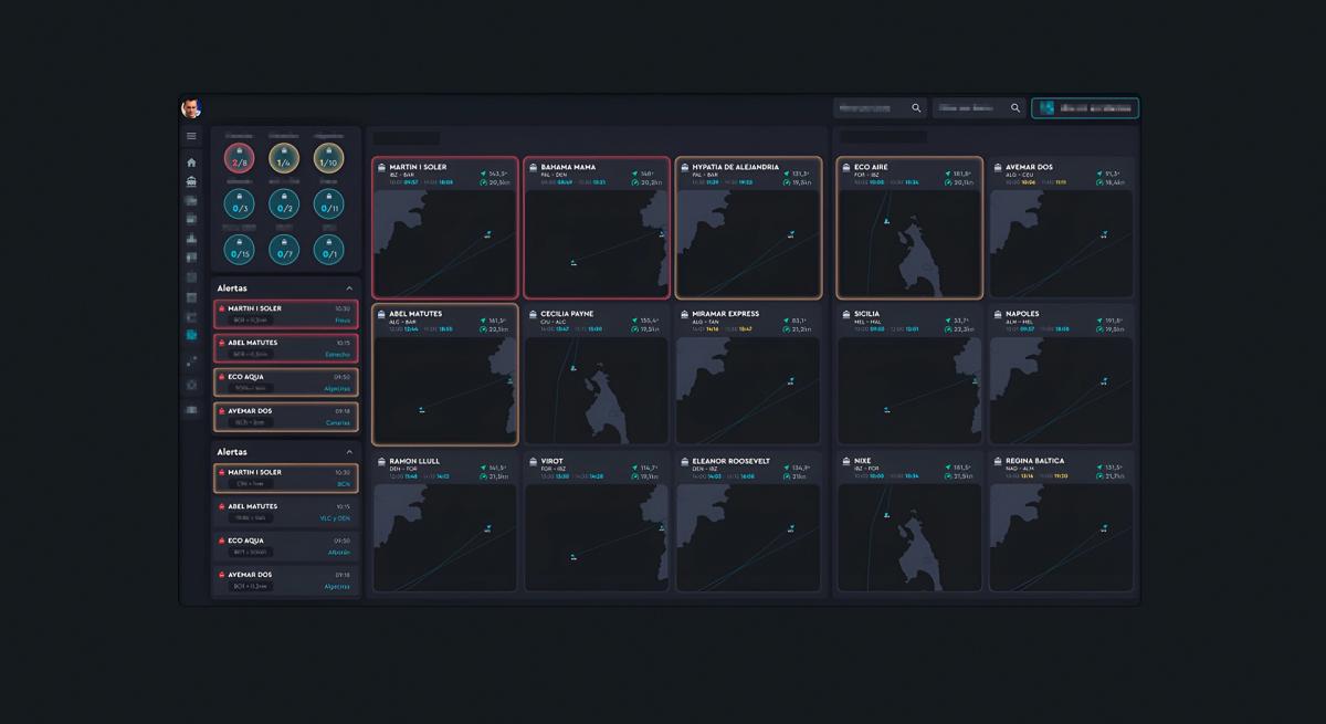
If the pattern of using the interface is in complete darkness, and the goal of the users is to preserve rod vision, then the choice of solution for the color palette is quite obvious:
- dark theme with minimal luminosity - absolutely black screen for the background;
- indicate on the screen only the minimum necessary interface elements;
- monochrome palette - only one color for interface elements;
- most likely, the color of the interface elements is red or green. Since they will be virtually the only elements that glow, very low luminosity is sufficient to make these elements visible and contrasty even to those who are color blind.
Here is an example of an industrial interface that will maintain night vision even at extremely low luminosity:
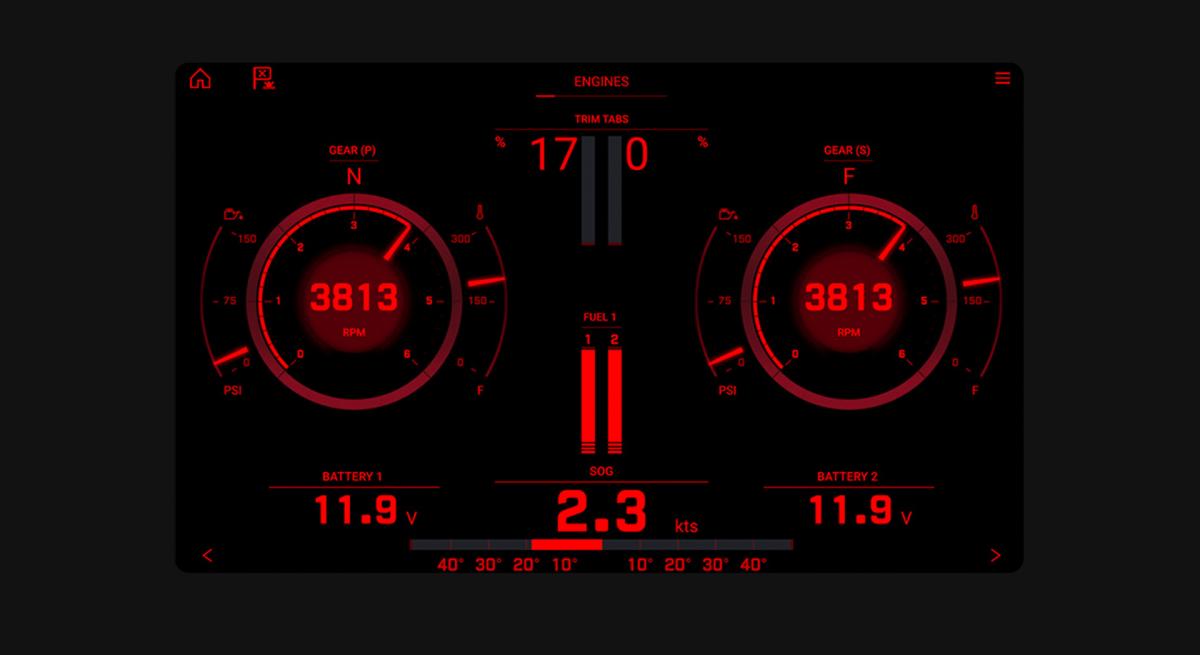
Sure, it looks very sharp and bright in this picture, but it's easy to dim the brightness to a level where the rods aren't blown out and you still have twilight vision.
Practice No. 4. Measure the luminosity of the interface and surrounding space
For most dark theme design situations, this practice is overkill, but if you're truly designing systems for usage in limited light environments, it's worth paying attention to this parameter: comparing the luminosity of the surrounding space and the screen of the system that users are working with while in that space.
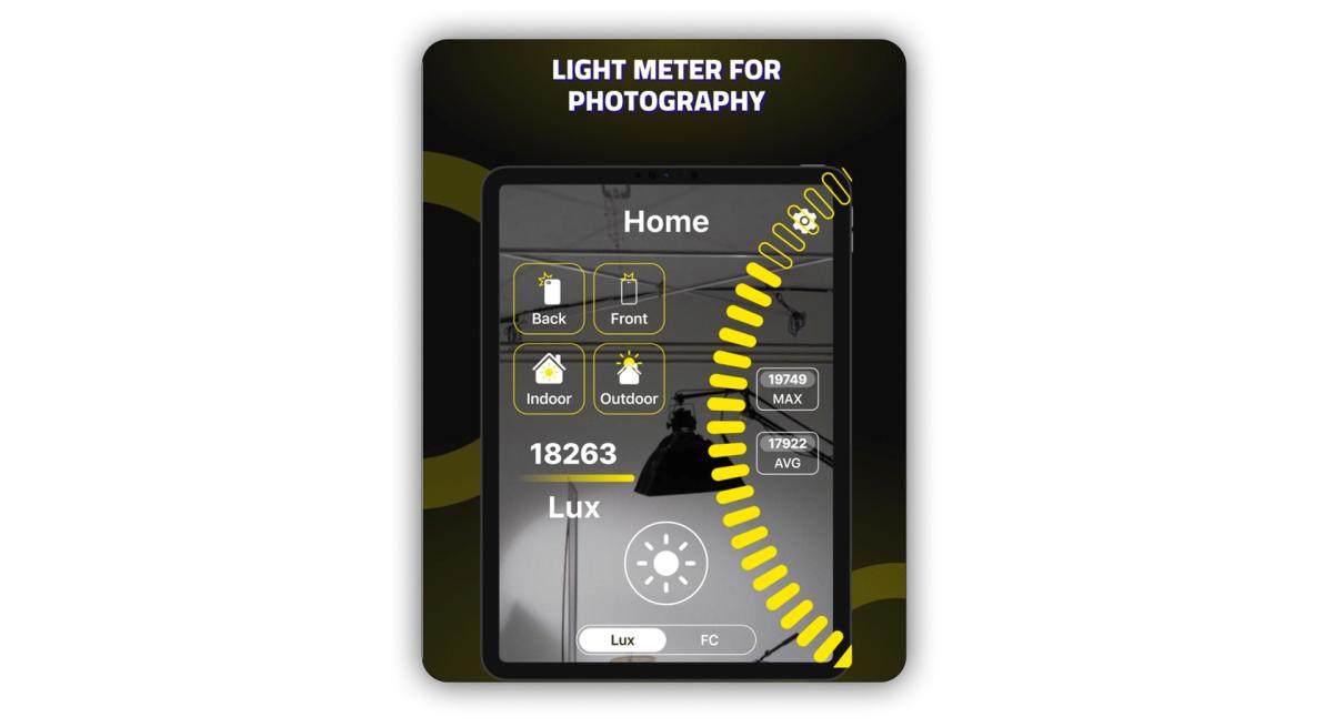
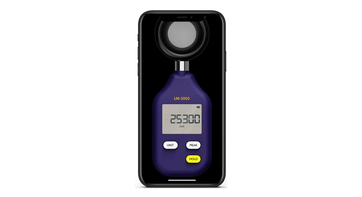
To do this, you can use photo lux meters: both hardware ones, which are used by photographers, and mobile applications for smartphones.
What is important in designing interfaces for twilight is the difference in luminosity between the interface itself and the surrounding area during typical application use. For example, compare the road illuminated by car headlights and the luminosity of the navigator application. The smaller this difference, the better the interface is adapted to usage patterns.
In the vast majority of cases, to design interfaces for low light, it is enough to take into account the design patterns of dark themes - for example, rely on the official Material Design guidelines. You can also learn a lot of interesting things from the report of designer Jason Barons at the conference: PUSH UX: Dark mode is wrong?