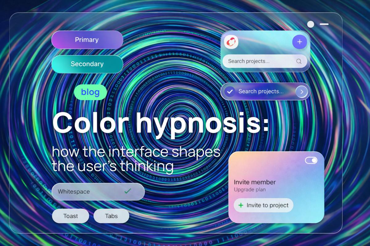
With Noveo Senior Designer Lyudmila, we've already discussed the ethics of modern design — and today we'll dive into the most subtle and powerful weapon in the interface arsenal: color.
Color in an interface is not aesthetics and not a "theme setting": it's one of the few tools that affect the user before thought. Before logic. Before decision.
The user hasn't yet understood what this product is, hasn't evaluated the functionality neither formed expectations — but color has already begun a dialogue with them.
This dialogue is almost never conscious. That's why color can be called a form of soft hypnosis.
Color as Subliminal Influence and Emotional Framework
The human brain processes information unevenly. Color belongs to so-called subliminal stimuli — signals that are registered before rational analysis.
When a user opens a website or app, the brain asks itself implicit questions: Is it safe here? Will it be difficult to figure things out? Is it worth my time? Color answers these questions faster than text. If the answer is negative — the user leaves, without even understanding why.
An interface is not a set of screens, but an emotional framework within which the user performs actions. The same scenario — data entry, decision-making, confirmation — will feel different depending on the color environment.
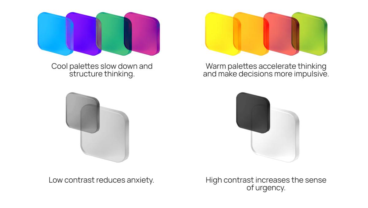
Color doesn't tell the user what to do. It creates a state in which the user themselves chooses how to act. That's why fintech, SaaS, and B2B gravitate toward restrained, cool palettes — not because "it's customary," but because color shouldn't interfere with rational decision-making.
Trust Can't Be Drawn — But It Can Be Destroyed by Color
Trust in a digital product doesn't arise from beautiful screens. It arises from a feeling of predictability. Color directly affects this feeling.
When:
- identical actions look different,
- different actions look the same,
- color doesn't match the expected outcome,
the user experiences micro-doubt. Many micro-doubts = absence of trust.
Trust in an interface is born where color doesn't mislead.
Color as a Tool for Reducing Cognitive Load
A good interface doesn't require constant attention — it saves the user's mental resources.
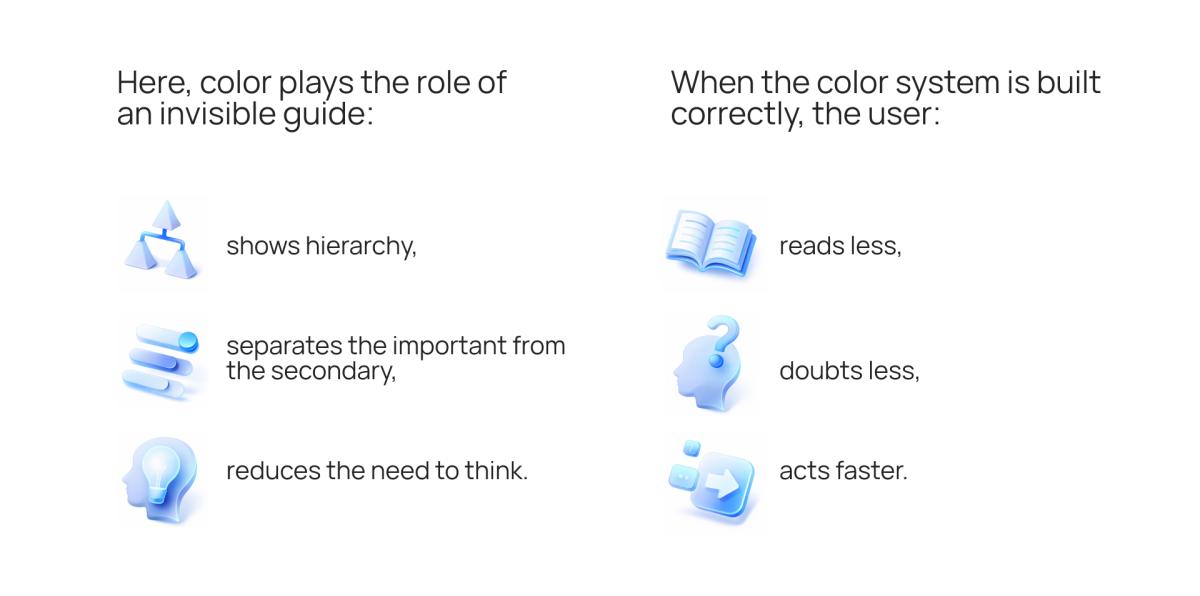
When it's built incorrectly — the product feels complicated, even if the logic is perfect.
Manipulation or Help?
Color can manipulate — make people click, hurry, fear, agree. But every such technique comes at a price.
If a product constantly shouts with color, pressures with contrast, exploits anxiety — the user starts to defend themselves. They either leave or stop trusting the interface's signals.
Good design uses color not for pressure, but for support.
The Boundary Between Ethical and Manipulative Color in Interfaces
Color is one of the few tools that can influence a person without their consent. That's precisely why the question of ethics in working with color is not an abstraction, but a practical necessity.
A manipulative interface doesn't always look aggressive. More often, it looks convenient — which is exactly what makes the line between help and pressure so thin.
What's the fundamental difference?
The key difference is in whose interests the color is used.
Color as Intentions Amplifier
Color itself is neutral. It becomes ethical or manipulative depending on what intention it amplifies.
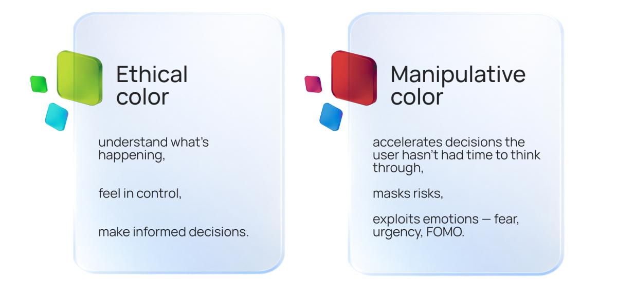
Ethical approach:
- Color emphasizes real advantages.
- Urgency is used only where it truly exists.
- Errors and risks are visually clear.
Manipulative approach:
- Color creates a sense of scarcity without real cause.
- Contrast is used for pressure.
- The user is led toward a decision that benefits the product, but not necessarily themselves.
Where Exactly the Line Is Drawn
1. Urgency vs. Pressure
Ethical:
Red or bright accents are used when:
- the action is truly irreversible,
- there are real time constraints,
- an error could lead to loss of data or money.
Manipulation:
Constant red banners:
- "5 minutes left" (which reset),
- "Last chance" without real limitation.
This way, color starts creating artificial anxiety.
2. Contrast vs. Coercion
Ethical:
Contrast helps quickly find the primary action.
Manipulation:
When alternative options are deliberately desaturated:
- the "Cancel" button is nearly invisible,
- "Continue without subscription" gets lost in the background.
The user technically has a choice, but visually — they don't.
3. Reassurance vs. Risk Masking
Ethical:
Calm colors are used to reduce anxiety during complex processes (e.g., filling out forms).
Manipulation:
The same calm blue is used to:
- hide risks,
- blur attention before an important decision (payment, subscription).
The interface looks "safe," even if the decision is risky.
4. Color Semantics: Honesty of Signals
Ethical:
- Green = success
- Red = error
- Yellow = warning
Manipulation:
- Green highlights paid upgrades as "recommended."
- Errors appear neutral.
- Risks aren't highlighted at all.
Color ceases to be a language and becomes a masking tool.
Dark Patterns and Color
Color is a key element of dark patterns:
- preselect options highlighted as the "best choice,"
- visually aggressive CTAs for undesirable actions,
- muted colors for cancel or decline options.
Formally, the interface is "clean," but in reality — it nudges the user toward specific actions.
How a Designer Can Self-Check
There's a simple internal test:
If the user realized how color was influencing their decision, would they agree with it?
If the answer is "no" — that's manipulation.
Ethical color isn't about "being kind." It's about long-term relationships.
Manipulative interfaces:
- may provide short-term growth,
but they:
- destroy trust,
- increase user churn,
- leave a negative emotional residue.
The user may not remember the screen, but they will remember how it made them feel.
What responsibility does the designer bear? A designer is not just an executor. They are:
- translator of business intentions into form,
- filter between metrics and the human.
Saying "This converts better" is easy. Asking "What does the user feel in this moment?" is harder. But this is precisely where the boundary of professionalism lies.
How to Test Color Meaningfully
A/B Tests — But Not Just for Clicks
It's important to measure not only CTR, but also:
- completed scenarios,
- errors,
- return visits.
Sometimes "brighter" = "worse."
Heatmaps as Mirrors of Reality
Heatmaps often show an uncomfortable truth: the user sees something different from what we considered important.
Color either guides the eye or betrays the design intent.
Session Replay as Behavioral Analysis
Hesitations, returns, chaotic clicks — these are traces of uncertainty. They often arise from an incorrect color hierarchy.
How to Build a Color System for SaaS Consciously
- Define the product's emotional goal.
Not "beautiful," but "calm," "confident," "fast." - Limit the number of colors.
Constraints create clarity. - Assign roles to colors, not just meanings.
Color is a function, not decoration. - Consider accessibility.
If an interface is only understandable to part of the users — it's incomplete. - Document it.
Color without rules ceases to be a tool.
Color as Part of Design Ethics
Every color in an interface:
- amplifies or reduces anxiety,
- accelerates or slows decisions,
- shapes the attitude toward the product.
A designer works not only with visuals. They work with human states. And in this sense, color is one of the most powerful and dangerous tools.
Color is not a style. Not a trend. Not a taste. It is a form of communication that happens before words. A good interface doesn't force — it negotiates, and color is its first, sensory argument. And if design is what the product looks like, then color is how it feels.